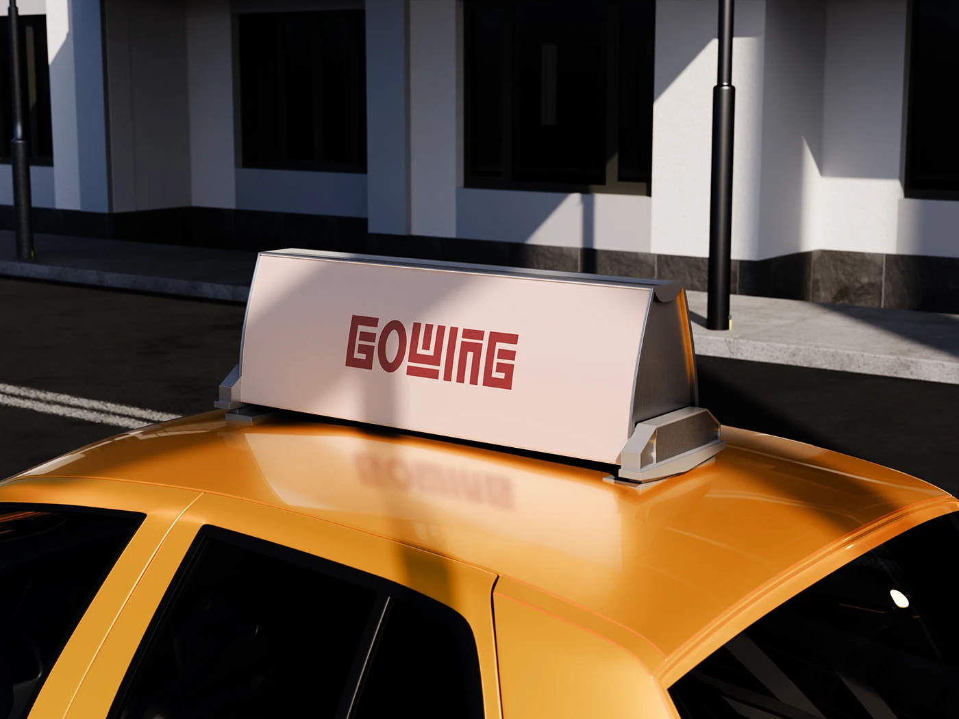
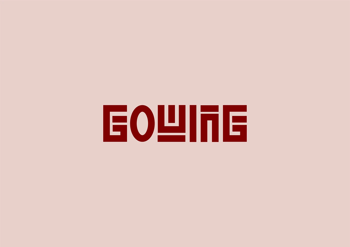
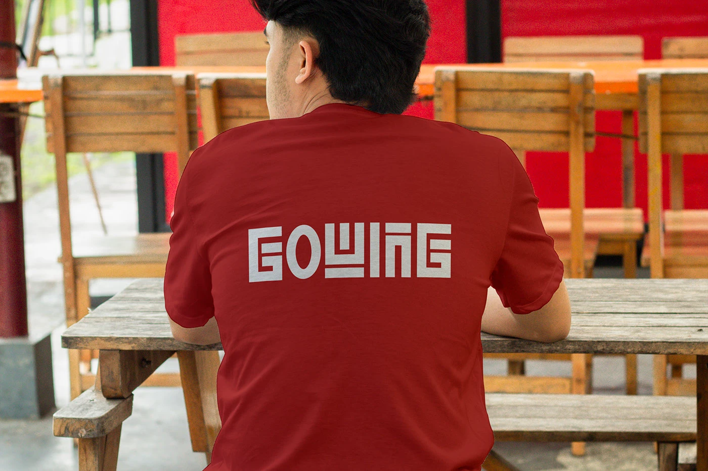
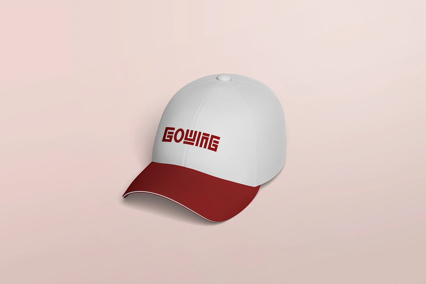
The GOWING wordmark logo was custom-designed by Mizzeo Digital to represent reliability, movement, and professionalism for a growing Indian cab service. The clean, modern typography focuses on clarity and readability, ensuring strong visibility across vehicles, digital platforms, and print branding. Sharp letter structures convey efficiency and trust, while the balanced spacing reflects smooth mobility and seamless travel experiences. Designed with scalability in mind, the logo works effectively on cab signage, mobile apps, websites, and promotional materials. Overall, the identity positions GOWING as a dependable, contemporary, and easily recognizable brand in India’s competitive transportation market.
Top
Trusted by 8000+ Brands | Logos, Websites & UI/UX That Actually Grow Your Business.


Contact Us
- Connaught Place, New Delhi, India 110001
- design@mizzeodigital.com
- +91 9599164248
Trusted by 8000+ Brands | Logos, Websites & UI/UX That Actually Grow Your Business.
Contact Us
- Connaught Place, New Delhi, India 110001
- design@mizzeodigital.com
- +91 9599164248